 |
Me, when Daddy Apple, Grandma Google (not pictured)
and Mommy Microsoft change their UI |
Apple is awesome at needless User Interface updates, though occasionally some useful features come out of their reckless restructuring. Finger gestures on their sweet-sweet touchpads is probably my favorite enhancement in the last decade. To contrast, Windows uses tried-and-true formulas and seems to think that there's no use in changing something that people already know. Remember the first time you saw a Windows (Start) key? Game changer. Then came the right-mouse-button key, and...nothing ever again to the keyboard. There are merits to innovation vs staying the course, but between the cracks are some poor choices for UI. Now, before I get started, I'll say that there are probably built-in solutions or separate applications that solve some of these issues, but the average user isn't aware, and that counts as poor UI to me.
 |
| You'd better have a good memory if you want to replicate that |
Layer restriction: In designing my email signature, I wanted to copy and paste from my inbox, the main Outlook page. This is 2 layers back, from Signature (top layer) to Compose (1 layer down) email to Inbox. but since the dawning of time, Windows won't let you select the screen more than one layer back. I can move the signature box out of the way to see the composed email below it. However, I can't move the next layer (Compose email) or interact with it. I see this interactive layer restriction in many applications, even this very website when uploading media.
Another example: say I want to upload an image, but forget where the cursor is and corresponding text. Add on the fact that the photos I'm looking for are buried under a 10-folder directory path. Too bad, can't look without closing out of the upload screen. Why is this still the standard right now? At the very least, you should be able to make layers transparent at-will.
Most apps let you drag and drop between your file explorer and content creator, which is a sweet alternative, but you still get trapped in situations like Outlook.
File management on your smartphone: Why-ohh-why do I have to
download a separate app to look at files on my phone in Android? Want to do the same on iPhone? Forget about it. On numerous occasions, I've put new music on my iOS/Android device, only to have whatever music app not recognize the song. Unless I've downloaded a file management app (why isn't this installed by default?), there's no way for me to check where the song went and begin a diagnosis without connecting it to a computer. Don't even get me started about needing iTunes to do the same for your iDevices. It's a silly form of restriction that Apple customers just deal with. A $1000 phone should be able to do anything and everything I want it to, damnit!
Traffic lights: Think about it, folks. We've shaken our fists at drivers who gun the engine through a freshly-red light. We've been the maniacs who are doing it, too. While drivers aren't blameless, ask yourself the question:
how long is a yellow light yellow?
The answer varies by intersection, not even block, city or state! There is no standard for something that is a daily danger (double-d for short. Actually, no one has ever called it that.) The burden is on the driver to make this split-second decision, when we could just implement something like a flashing yellow light that pulses 4 times before going red. While we're talking about good ideas for traffic lights,
B.C. has flashing green lights that mean a pedestrian has activated the cross walk button, and so be on the lookout. Federal mandate, pronto!
 |
| Side note: that ad off to the right... |
Ad placement in on Youtube: Using anything besides Chrome means I have to run Youtube without AdBlocker. Before the FCC ruins it and makes us all pay Comcast a Youtube premium, the company needs to pay for that data-gobbling with advertising, which I have no problem with in general. The problem is the 5-, 10- and even 30-minute advertisements that will begin in the middle of your hourlong video on the
110 reasons why Star Trek Discovery is the greatest show ever. We can all sit through a minute or so of commercials, but there's no rhyme or reason when these display; sometimes the videos stop mid-word!
 |
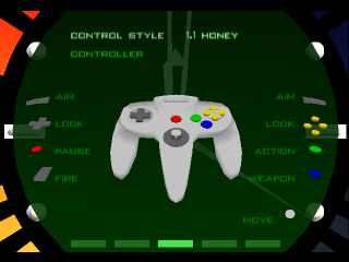
an oldie, but Goldeneye had atrocious controls. Move with the stick
and aim with the D-pad or C-buttons. Gross. |
Lack of customizeable controls in at least 50% of videogames: Why is this still a thing? If the controller has a trigger on it, why is the shoulder button above it the one to fire? Maybe the developers have thoroughly thought out the perfect control scheme. Good job, but there are always people who want something different, and might even get turned off by controls that aren't so great. I've
written about this before, and there is also a collective of disabled gamers who have created their own controllers that don't work properly if a game doesn't have customizeable controls. There is just
no good reason for this not to be a standard requirement. Unassigned buttons are Step 1 in designing controls, FFS!
Logins: I've already
written an entry about password recovery. The gripe is when you put in the wrong info and the website doesn't confirm whether the login or password is what's wrong. This is probably a security feature, but is also frustrating because I personally have about 50 different accounts that use one of 5 email addresses. Even at my workplace, the handful of applications have different login schema, whether that's first.last or email or id#. Employers should read my blog!
Anyone can wave off these gripes as petty first world problems, but the businesses responsible for these had a goal of creating a good product that's easy to use, so there's that, too.
What about you: At work and in your personal life, how many accounts do you have that require a login? There's a
poll under this post!


